- Introduction
- General Design Principles
- Gradual reveal
- Information discrimination
- Reduce cognitive burden
- Context matters
- Flexibility
- Visibility of current selection/system status
- Actionability
- Compactness
- Minimize choices
- Redundancy in perceptual cues, not information
- Content as navigation
- Accessibility and Universal Design
- Consistency and Standards
- Error Prevention and Recovery
- Help and Documentation
- Resources
- References
Without good communication, designers who are unaware of solutions may be forced to ‘reinvent the wheel’, wasting unnecessary effort on a problem that has already been solved by others. Thus this section attempts to capture and codify best practice solutions to information visualisation design problems for those engaged in the practice. It includes both a list of general design principles as well as a Data Visualization Checklist for more tactical, styling-oriented evaluations.
This list is a combination of curated content from notable sources in the industry such as NNgroup and Juice Analytics, and also draws on experiential learning gained from working on client projects at Axis Group.
This section attempts to highlight some general design principles that should be followed when designing data vis. These should be treated as 'heuristics' because they are broad rules of thumb and not specific usability guidelines. Another important thing to note is that not all of these can be incorporated into a single dashboard and there is usually a tradeoff involved eg. flexibility vs. minimizing choices. Instead, we suggest prioritizing one or two general principles in order to stay focused.
The foremost mantra we follow when designing visualization
Overview first, zoom and filter, then details-on-demand. Shneiderman, 1996
The Visual Information-Seeking Mantra [Shneiderman, 1996] is also sometimes referred to as the 'Gradual Reveal' principle and forms a good basis for avoiding overcluttered dashboards.
“Data isn’t like your kids, you don’t have to pretend to love them equally.” Amanda Cox, NY Times
In their guide on 'Designing Dashboards People Love to Use', Juice analytics break this principle down into 3 succinct steps-
1. Find the core: Your dashboard should be more than just a lot of data on a screen.
It should have a core theme based on the essence of the problem.
2. Ask a better question: Dashboard requirements can quickly turn into a laundry list of
unrelated metrics, dimensions, and half-baked analyses. The root of this problem stems
from only asking “what would you like to know?” Here’s the one follow-up question you need
in order to narrow down the list: “What would you do if you knew this information?”
The Axis Group Reference Sheet provides some example questions to ask to keep yourself focused during your interviews and also a quick checklist to summarize your results.
3. Reporting vs. exploration: For all the things that a dashboard can be, it cannot be a
generic analysis tool. It cannot be designed to slice and dice data to explore and answer
a new question every time. This is a dynamic we refer to as the difference between herding
cows and herding cats.
Here is an excellent article that clarifies the semantics of 'exploratory' interfaces in data visualization.
To sum up, ask the following questions when making decisions-
- What metrics are a must, or necessary to all users?
- What’s necessary to certain users, but not to the others?
- What’s nice to have but not necessary?
- What doesn’t really make sense?
(Because cognition is a scarce resource.)
"Attention is a resource —a person has only so much of it."
Matthew Crawford
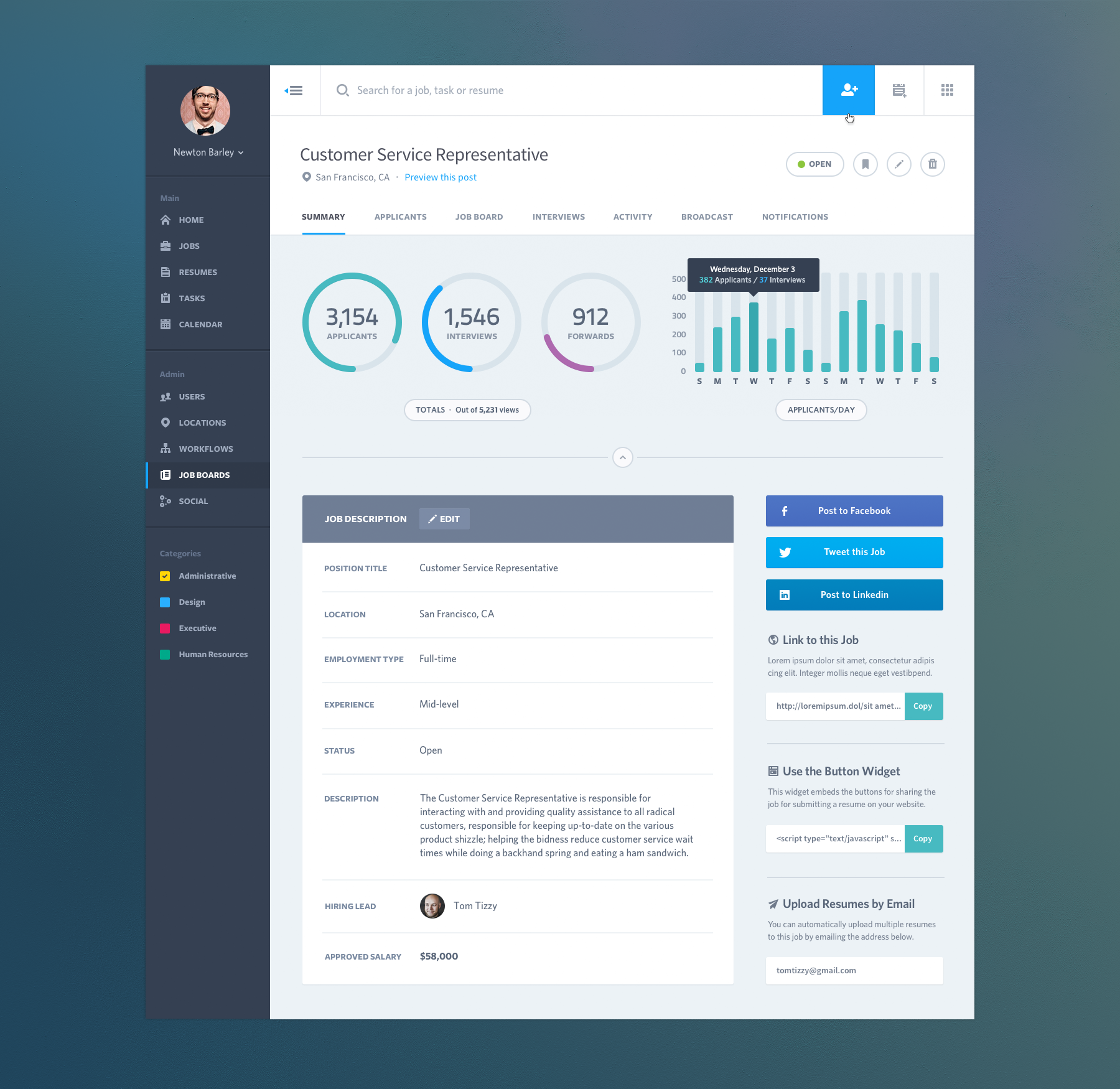
Separate news from the noise: Make important information salient and easy to get to using visual cues, interaction techniques, and other functionalities. Avoid clutter. Contrast is a great way to draw the eye to important information.
Source: https://zurb.com/word/visual-weight
Push vs. Pull-To the extent possible, the burden of highlighting important information should be borne by the interface, and not by the user (e.g. with alerts and notifications).
Promote recognition rather than recall by using familiar metrics and common patterns. When needed, provide details so that the user does not have to remember information from one part of the dashboard to another.
Allow people to bookmark, save, tag, and annotate, so that they don't have to remember what was interesting or important.
Instructions for use of the system should be visible or easily retrievable whenever appropriate.
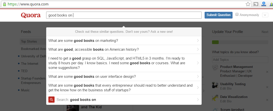
In the example below, Quora suggests possible questions based on what is being typed:

Calculate the right metric for users, and provide the most actionable metric or information. For example, it may be important to focus on variances rather than absolute changes (e.g. change in sales since last year vs. total sales).
Use recognizable icons and UI components with clear affordances.
Maximize contrast between data and the background to increase readability.
Group similar elements together by using white space, borders, and/or tiles.
Ensure distinguishability between elements.
Use clear affordances so that users will know how to interact with a chart, whether it's clickable or hoverable.
Simplicity is key!
Layout and order of presentation matter. Start with the summary-level metrics first, and uncover more complex data and charts as user works through the dashboard.

Many factors play into the readability of your content, such as typeface, font size, color, etc. The following is a font framework that Juice Analytics has provided:
- Body text is clean, readable content
- Headers separate and name major sections of your work
- Notes describe additional things the reader should be aware of. These should fade into the background unless we call attention to them.
- Emphasis text is what we want our reader to pay particular attention to.
Use this framework to make decisions on typeface (serifs vs. sans serif), font size, and color.
Additionally, to ensure comprehension the system should speak the users' language, with words, phrases and concepts familiar to the user, rather than system-oriented terms.
Source: https://photoshopcafe.com/tutorials/typography/typography-tips.htm
People need context and explanation to understand new and unfamiliar events. Providing data without text, labels, or instruction is the difference between a chef presenting a gourmet meal and fishmonger throwing a mackerel at your head. Letting the data speak for itself can be a recipe for misinterpretation and confusion.
Remember that you will not be there to explain things when your users are interacting with the dashboard, so provide all the text, labels, and instruction necessary to give them context. Providing context isn't limited to writing instructional information; it can also include information about how data has changed since last month, when the data was last updated, whether the data is normal or abnormal, what the macro trends are, and so on.
Build in flexibility to allow the dashboard to become relevant for different users but also provide good defaults. The most common way to allow users to customize the dashboard is by defining the scope of the data using filters. Other options include designing the dashboard to let users save the view they’ve configured or offering easy ways to tag or highlight particularly relevant information.
Per Jakob Nielsen's 10 Usability Heuristics:
The system should always keep users informed about what is going on, through appropriate
feedback within reasonable time.
Continually keep users updated with what current selections they've applied to the data, so that they know they are looking at a filtered dataset. For example, use text that reads like "Showing 5 of 10 results" or that literally says "Filters Applied". Be clear about what visualizations are being affected by the current selection- whether it's all visualizations or just a few.
Make sure the current state selected in checkboxes, toggles, and dropdowns are also clearly visible.
Enable users to not just complete tasks quickly and get easy insights from their data, but also to take actions based on what the data reveals. Call out items in a dashboard like outliers, issues, alerts, and changes in metrics. Take it one step further by providing guidance on what the next step is. For example, if the revenue of a company has dropped by over 50% from the prior year to date, highlight this piece of information but also have additional visualizations to show why this has happened. This will enable the user to take action based on the information. The example dashboard below highlights critical issues in red.
Source: https://dribbble.com/shots/1971409-Alert-management-tile-view?list=shots&sort=popular&timeframe=now&offset=84
Compactness is the property that a design can fit inside a human being's head...Compact software tools have all the virtues of physical tools that fit well in the hand. They feel pleasant to use, they don't obtrude themselves between your mind and your work, they make you more productive.
Compact is not equivalent to ‘weak’. A design can have a great deal of power and flexibility and still be compact if it is built on abstractions that are easy to think about and fit together well. Nor is compact equivalent to ‘easily learned’; some compact designs are quite difficult to understand until you have mastered an underlying conceptual model that is tricky, at which point your view of the world changes and compact becomes simple.
A few tactics to design compact dashboards:
- Break a dashboard into bite-sized pieces, each built around a key question.
- Increase data-ink ratio by leveraging data dense visualization techniques such as small multiples, glyphs, sparklines etc.
To the extent possible reduce the number of choices a user has to make. Less is more in design. Having a screen with multiple toggles, filters and animations can overwhelm the user if not designed right.
Avoid excessive redundancy in information as it can add clutter. For example, labeling the axis of a bar chart as well as directly labeling the value of the bars can be redundant.
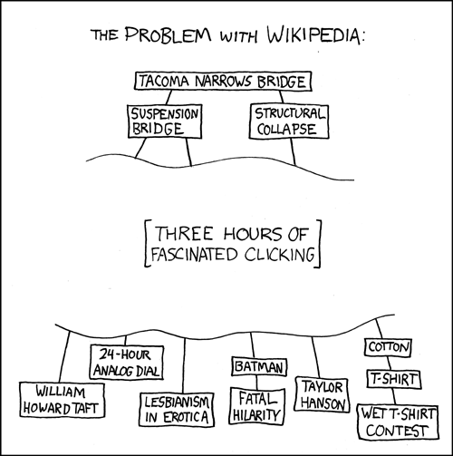
While the navigation bar does serve as an 'emergency exit', designers should bake in interactions into the visualization itself so that users are able to achieve different steps of their workflow using the content.
Source:https://www.explainxkcd.com/wiki/index.php/214:_The_Problem_with_Wikipedia
The 7 universal design principles were developed to assist in the guiding and evaluating of design, for the purpose of creating more usable products and environments for all people.
Accessible design is the process of ensuring that a design can be used by people with a variety of disabilities. The A11y Project is a great resource, with various tools (i.e. VoiceOver) and tests (i.e. Color Contrast Analyzer) you can use to make your design more accessible.
Consistent design lends to more intuitive design, since it will allow users to more quickly learn an interface. Per Jakob Nielsen, "users should not have to wonder whether different words, situations, or actions mean the same thing." Maintain consistency on both visual and functional fronts.
Use UI Patterns (recurring solutions that solve common design problems) to ensure that you're utilizing a common design language that users are already familiar with.
Per Jakob Nielsen,
Even better than good error messages is a careful design which prevents a problem from occurring in the first place. Either eliminate error-prone conditions or check for them and present users with a confirmation option before they commit to the action.
Sometimes you may need to provide a user additional documentation around the interface or the visualizations. For instance, users might need assistance in reading a chart or knowing the meaning of specific technical terms. Make such information easily accessible and in an obvious location.
At a tactical level, particularly in regard to styling, the following resources serve as excellent examples of these principles being applied in a data visualization context.
https://www.mat.ucsb.edu/g.legrady/academic/courses/11w259/schneiderman.pdf
https://www.nngroup.com/articles/ten-usability-heuristics/
https://juiceanalytics.squarespace.com/s/Guide_to_Dashboard_Design.pdf
http://www.juiceanalytics.com/writing/better-know-visualization-small-multiples
https://blog.prototypr.io/10-usability-heuristics-with-examples-4a81ada920c
http://www.usabilityfirst.com/usability-methods/heuristic-evaluation
http://www.uxforthemasses.com/dashboard-design/


