-
Notifications
You must be signed in to change notification settings - Fork 17
New issue
Have a question about this project? Sign up for a free GitHub account to open an issue and contact its maintainers and the community.
By clicking “Sign up for GitHub”, you agree to our terms of service and privacy statement. We’ll occasionally send you account related emails.
Already on GitHub? Sign in to your account
Requesting an additional sample: grid layout with different font sizes #31
Comments
|
Short answer is: libui does not support setting fonts/colors on standard native controls yet. Currently, libui only supports setting font/color on the custom-graphics In any case, I would have recommended the |
|
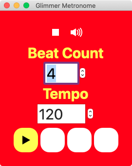
In the meantime, you can definitely use Glimmer DSL for SWT. It does work in JRuby (yes, you can use Glimmer in JRuby). And, it suports setting fonts/colors on labels and standard controls as you can see in the Glimmer Metronome app (see how the fonts are huge and the label is colored yellow): Example code taken from Glimmer Metronome: label {
text 'Beat Count'
font height: 30, style: :bold
foreground :yellow
}
spinner {
minimum 1
maximum 64
selection <=> [@rhythm, :beat_count, after_write: method(:build_beats)]
font height: 30
}Glimmer DSL for SWT gives you the additional benefit of being able to package the application you build as a Windows EXE/MSI installer if you like (in addition to being able to package a Mac APP/DMG/PKG and Linux DEB/RPM file). Links: |
|
So, I've been able to hack a solution in Glimmer DSL for LibUI by utilizing the combination of Screenshot: Code: require 'glimmer-dsl-libui'
MD5Model = Struct.new(:expected_md5sum, :file_path, :calculated_md5sum, keyword_init: true)
class MD5SumApp
include Glimmer::LibUI::Application
before_body do
@md5_model = MD5Model.new
end
body {
window('MD5sum comparer', 1060, 400) {
vertical_box {
horizontal_box {
text_label(
'Here you can enter the MD5 sum which the .iso file should have:',
text_x: 5,
text_y: 0,
width: 350,
height: 120,
font_descriptor: {size: 30, weight: :bold, italic: :italic},
)
entry {
text <=> [@md5_model, :expected_md5sum]
}
label # just a filler
}
horizontal_box {
text_label(
'Here you select the file to check its md5sum:',
text_x: 5,
text_y: 0,
width: 350,
height: 120,
font_descriptor: {size: 30, weight: :bold, italic: :italic},
)
entry {
# setting on_write to return nil ensures this is read-only
text <=> [@md5_model, :file_path, on_write: ->(val) {nil}]
}
push_button(
'Open file',
text_x: 100,
text_y: 45,
width: 350,
height: 120,
font_descriptor: {size: 30, weight: :bold, italic: :italic},
) {
on_mouse_up do
@md5_model.file_path = open_file
end
}
}
horizontal_box {
text_label(
'The md5sum of the .iso file is:',
text_x: 5,
text_y: 0,
width: 350,
height: 120,
font_descriptor: {size: 30, weight: :bold, italic: :italic},
)
entry {
# setting on_write to return nil ensures this is read-only
text <=> [@md5_model, :calculated_md5sum, on_write: ->(val) {nil}]
}
push_button(
'Evaluate the md5sum',
text_x: 15,
text_y: 45,
width: 350,
height: 120,
font_descriptor: {size: 30, weight: :bold, italic: :italic},
) {
on_mouse_up do
if @md5_model.file_path
@md5_model.calculated_md5sum = `md5sum #{@md5_model.file_path}`.split[0]
else
msg_box('ISO File Missing', 'Please select an ISO file first!')
end
end
}
}
}
}
}
# text label (area-based custom control) built with vector graphics on top of area.
#
# background_fill is transparent by default.
# background_fill can accept a single color or gradient stops just as per `fill` property in README.
# border_stroke is transparent by default.
# border_stroke can accept thickness and dashes in addition to color just as per `stroke` property in README.
# text_x and text_y are the offset of the label text in relation to its top-left corner.
# When text_x, text_y are left nil, the text is automatically centered in the label area.
# Sometimes, the centering calculation is not perfect due to using a custom font, so
# in that case, pass in text_x, and text_y manually.
def text_label(label_text,
width: 80, height: 30, font_descriptor: {},
background_fill: {a: 0}, text_color: :black, border_stroke: {a: 0},
text_x: nil, text_y: nil,
&content)
area { |the_area|
rectangle(1, 1, width, height) {
fill background_fill
}
rectangle(1, 1, width, height) {
stroke border_stroke
}
text_height = (font_descriptor[:size] || 12) * (OS.mac? ? 0.75 : 1.35)
text_width = (text_height * label_text.size) * (OS.mac? ? 0.75 : 0.60)
text(text_x, text_y, width) {
string(label_text) {
color text_color
font font_descriptor
}
}
content&.call(the_area)
}
end
# push button (area-based custom control) built with vector graphics on top of area.
#
# background_fill is white by default.
# background_fill can accept a single color or gradient stops just as per `fill` property in README.
# border_stroke is black by default.
# border_stroke can accept thickness and dashes in addition to color just as per `stroke` property in README.
# text_x and text_y are the offset of the button text in relation to its top-left corner.
# When text_x, text_y are left nil, the text is automatically centered in the button area.
# Sometimes, the centering calculation is not perfect due to using a custom font, so
# in that case, pass in text_x, and text_y manually.
#
# reuses the text_label custom control
def push_button(button_text,
width: 80, height: 30, font_descriptor: {},
background_fill: :white, text_color: :black, border_stroke: {r: 201, g: 201, b: 201},
text_x: nil, text_y: nil,
&content)
text_label(button_text,
width: width, height: height, font_descriptor: font_descriptor,
background_fill: background_fill, text_color: text_color, border_stroke: border_stroke,
text_x: text_x, text_y: text_y) { |the_area|
# dig into the_area content and grab elements to modify in mouse listeners below
background_rectangle = the_area.children[0]
button_string = the_area.children[2].children[0]
on_mouse_down do
background_rectangle.fill = {x0: 0, y0: 0, x1: 0, y1: height, stops: [{pos: 0, r: 72, g: 146, b: 247}, {pos: 1, r: 12, g: 85, b: 214}]}
button_string.color = :white
end
on_mouse_up do
background_rectangle.fill = background_fill
button_string.color = text_color
end
content&.call(the_area)
}
end
end
MD5SumApp.launchThis works for me on the Mac and I would expect it to work on Linux too. You'd have to amend it to make it work on Windows. Also, you might have to customize the font/text_x/text_y/width/height values depending on the operating system. Cheers! |


Hey there Andy,
This one is a little bit of a real request. If you lack time, please don't worry - it's fine to close the request here.
Recently I wanted to explore a bit the use case of "write once, run everywhere" via a GUI.
My use case was super-simple: I just wanted a GUI where I can query the md5 sum of a linux
.iso file (a linux distribution).
On Linux we can use md5sum; on windows we can also use a commandline variant via
"certutil". Ok, so far so simple - one more requirement was to add a "open local file"
button. I also wanted to do this via libui and via the www (via sinatra actually).
The ruby-gtk and ruby-libui variants already work; I am working on the www stuff next.
Anyway.
So I first created a ruby gtk solution - this is quick and dirty, I don't care about looks that
much initially:
https://i.imgur.com/ZKdz1t2.png
Isn't super-pretty, I know, but I wanted to focus on the functionality first. Looks can be
improved at a later time.
I was using a grid layout for this.
I worked on the ruby libui variant, and while it does not look great, it works, and the
functionality was the most important thing for me:
https://i.imgur.com/y6B1Ief.png
(Somehow the grid seems to work a bit differently but anyway, I wanted to focus on
the functionality.)
Now: I need to create more libui widgets for windows specifically. One use case is
an elderly relative who doesn't have great vision anymore, so i need to use
larger fonts. It is somehow possible in libui, e. g. the attributed string, but I haven't
figured it out really. So, the natural next logical step would be to use glimmer -
you provide many examples in regards to font size. But I have not yet seen an
example where multiple texts are used with different fonts, and perhaps even
font colours.
So my request would be: could you, if time permits, add ONE example to the
examples/ directory? Ideally the example shows different texts with a different
font size, if that is possible, and also colour. Could be up to 5 different texts,
perhaps in a horizontal box (could suffice) or a grid. And, if possible, when this
works for an entry (user input, multiline entry or just single entry) to also have
different fonts. Actually I am primarily interested in the font size, due to my
requirement that this works easily for a person whose vision is somewhat
poor already (e. g. +80 years old).
(I may then have to use a module with the shared functionality so I can just
include the basic stuff, and have this all work, including for glimmer. Having
a wide range of examples is very useful because I can test it as-is. I can
of course experiment on my own, which I tend to do for other toolkits,
but I am kind of a "minimalist" when it comes to learning, e. g. work on a
problem, then I get distracted. I have made a few tiny GUIs via glimmer
already but I am not really anywhere really "proficient" yet. Another use
case I may have is to use SWT eventually or just jruby but I am not sure
if glimmer works with jruby. Anyway I am off to work on the www stuff
next, thank you for reading!)
The text was updated successfully, but these errors were encountered: